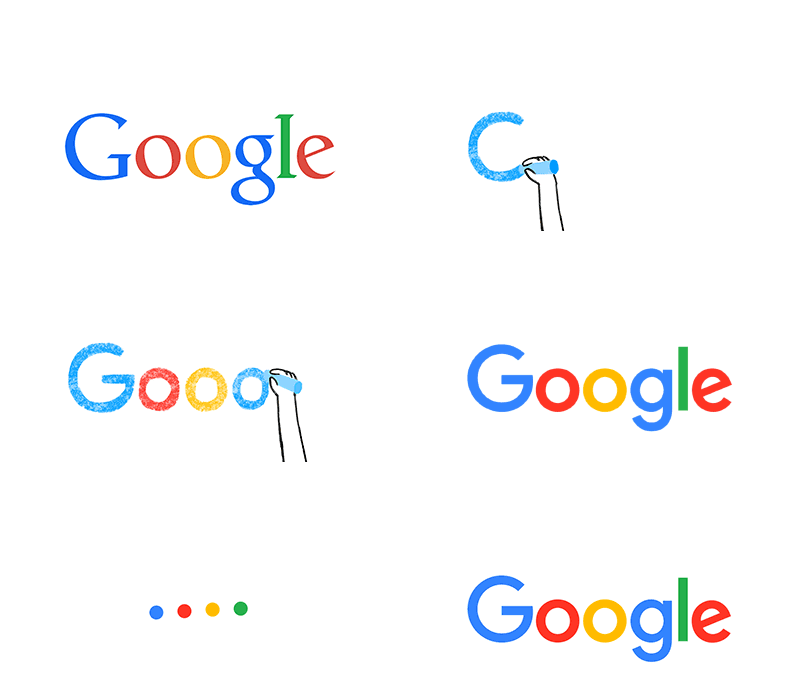
In keeping with their new direction, last week Google unveiled an updated logo, a much more simplified and modern-looking incarnation than its predecessors. After hearing what graphic designers had to say about it, we asked our CEO, Marc Sampogna, about his thoughts on the redesign.
By no means am I a graphic designer, but one thing I do know is branding. The latest redesign of Google’s brand identity seems to be a small step for a company that’s introduced innovation after innovation to the world. Its simplicity and approachability elicits memories of how Pepsi transitioned from their bold, bubble lettered logo into their current, more contemporary “brand stamp”. I also think this falls coincidentally on the heels of Apples recent software update — OS X Yosemite, where they moved from a beveled, dimensional treatment to flat. If anything, this new logo actually feels more playful and childlike, but no matter what they’ve done, it surely won’t impact how people interact or use the search engine powerhouse. It’s Google, for s*#ts sake. They change their logo daily to reflect a relevant theme that’s taking place in our culture. So…I have one word to say about the new logo, and that is “whatever”.
]]>
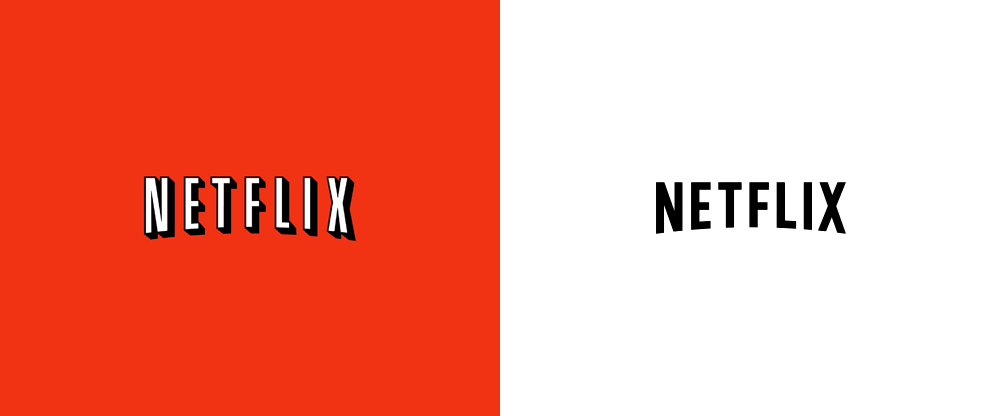
When asked to comment on Netflix’s new logo, here’s what Marc Sampogna had to say…
I like the new Netflix’s logo design versus the old. It’s more contemporary and certainly updates the brand substantially. However, a brand such as Netflix isn’t in need for a dramatic makeover because they are so engrained in our culture. The name itself is synonymous with streaming video, therefore, any change to the logo would have an incremental effect on how consumers view the brand.
Personally, I’m more interested in seeing the next big thing from Netflix. They’re tackling the production space with hits like House of Cards and Orange is the New Black, but what’s next? Will they move into creating their own line of electronic hardware, such as televisions or smartphones? If Amazon is thinking about doing it, then I’m sure Netflix is too. Either way, I remain a loyal Netflix user, and will continue to regardless of a good or bad logo redesign.
]]>
