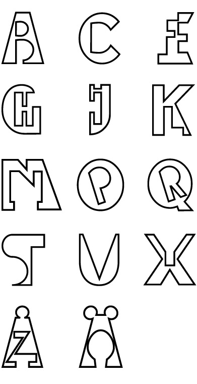
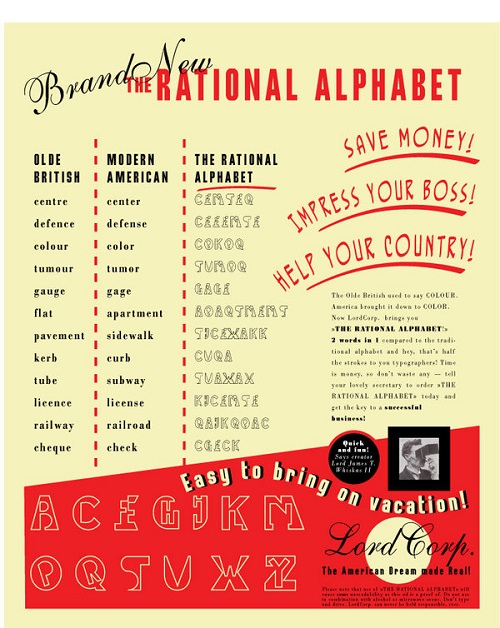
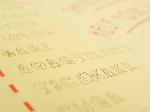
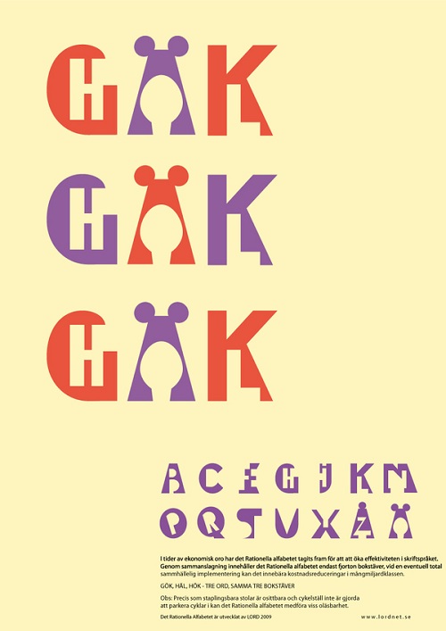
Gustaf Lord, a designer located in Sweden, created a new typeface which is supposed to increase efficiency in writing. The alphabet is designed so letters are combined, cutting the alphabet to just 13 letters. The design is supposed to save time, decrease paper usage, and reduce the amount of ink used. That may be true, but what about legibility? The typeface may make it more difficult to read, almost as if you are reading in code. With that in mind, does that make this alphabet efficient and rational?
[via]


